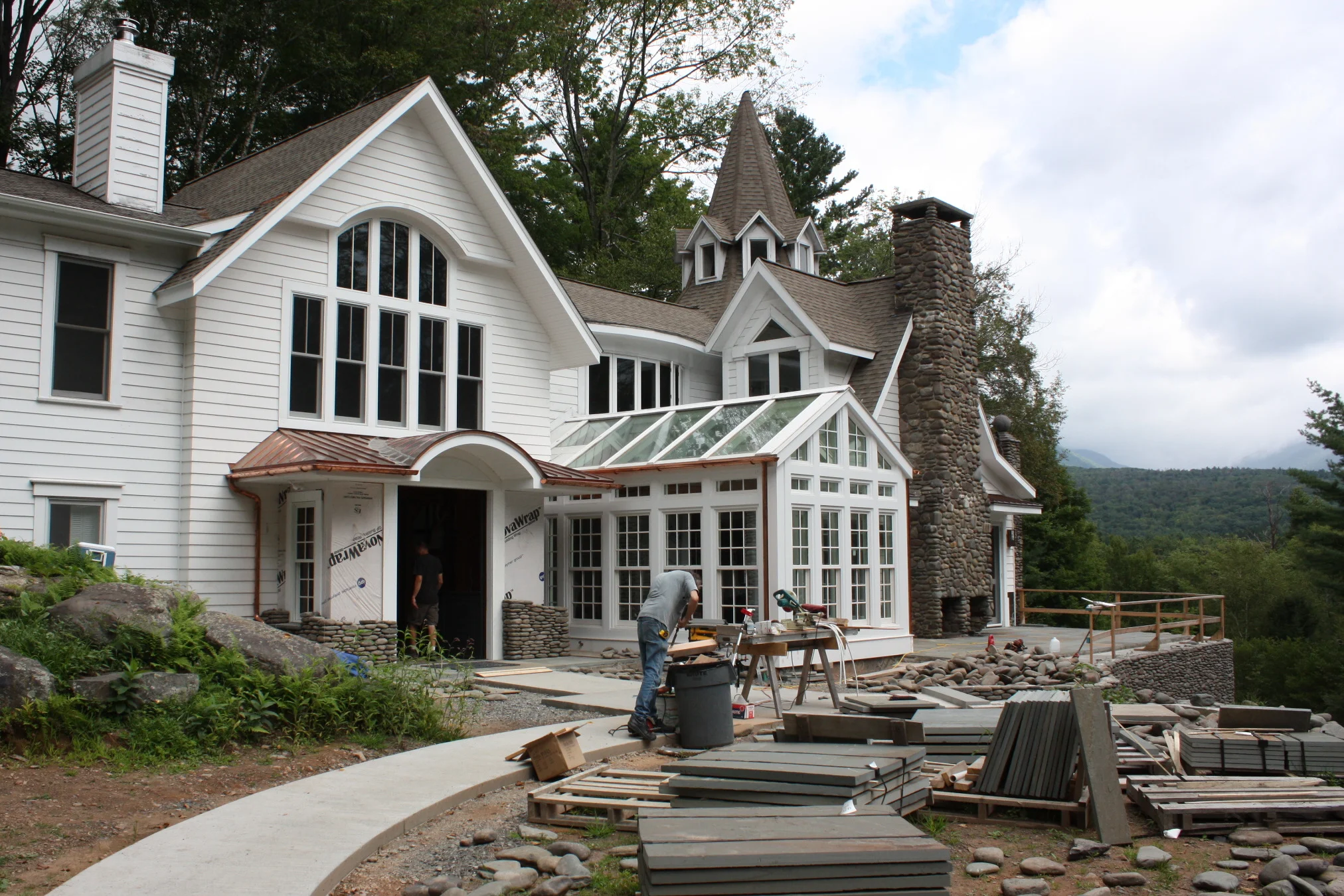
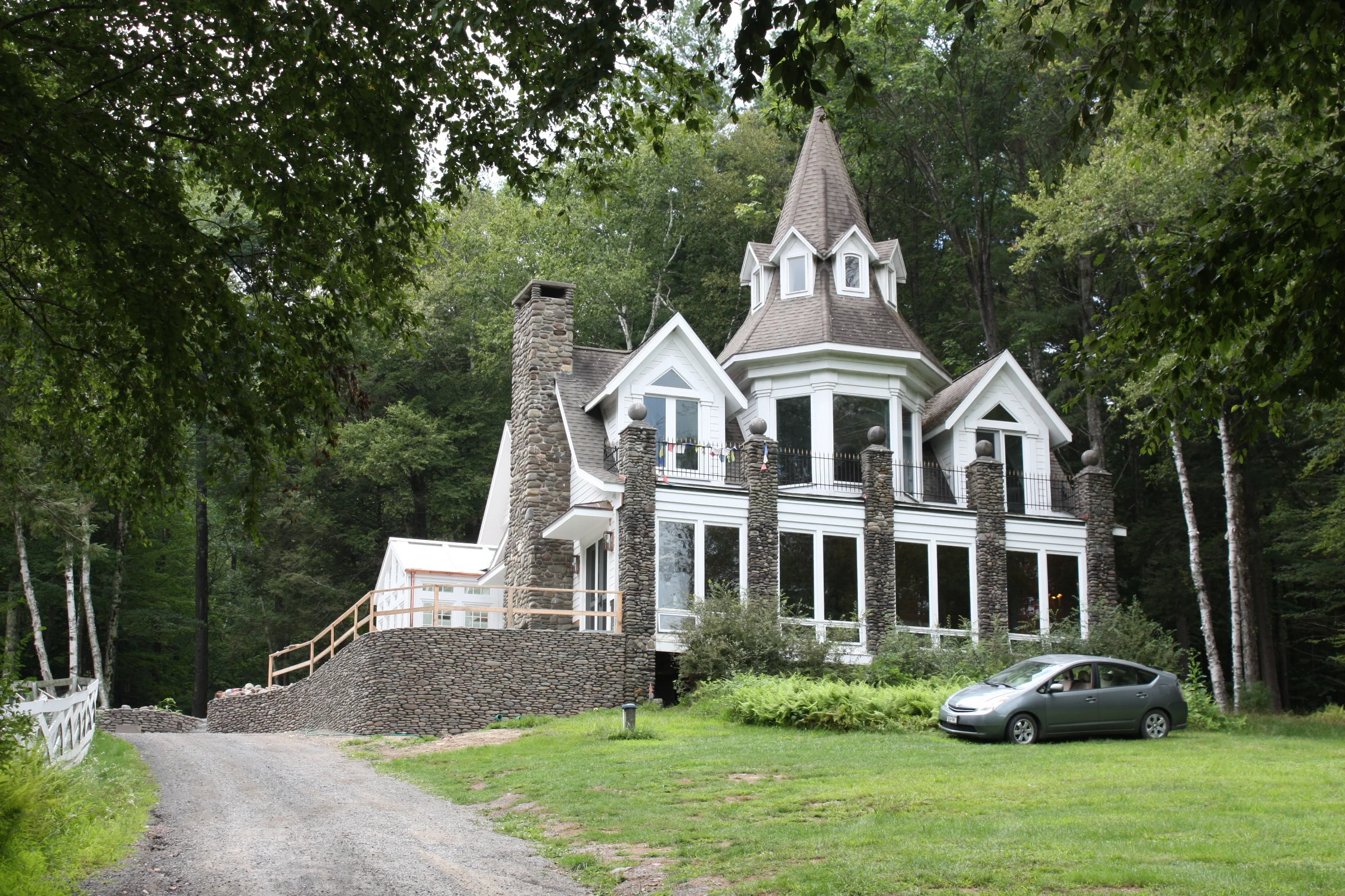
My renovation project in Woodstock, NY for a repeat client is winding down. The interior is almost complete as is the building facade. What remains is the balance of the site work, which will be brought to a point of conclusion before the first frost but may take many seasons to complete.
This renovation started with a modest scope and grew. Soon after closing on the three-story property, the owner purchased a vertical lift to provide access for a wheelchair bound family member. Then they called me. The lift had to be located and my solution was to center it in the existing stairwell and install a new cherry wood wrap-around stair.
The scope grew again. The owner decided to: re-make the front facade and re-situate the entry; install radiant heat throughout the house and new wood flooring all along the first floor; modify the master bedroom suite; finish the cellar; and re-grade the front yard.
A ground floor bathroom adjacent to an existing bedroom was gutted and converted into a sleek and accessible bathroom.
I like accessible design. I use its guidelines even when designing spaces that need not be accessible because I know that if I adhere to its basic principles, my spaces will be appropriately sized.
Accessible design has, in my mind, been tarnished by a medicalized aesthetic obsessed with safety, hygiene, and security. And, while those issues are of utmost importance, the manner in which they are often depicted contributes to the marginalization of people with disabilities. I, alternatively, argue for a comprehensive approach, one in which accessible design is personal, dignified, and integrated. Over the past decade, I have tried to achieve these goals in several New York area projects. Accessible design need not look institutional. And conversely, I think many principles of accessible design should be universalized. A grab bar in a tub or shower is always a good idea.
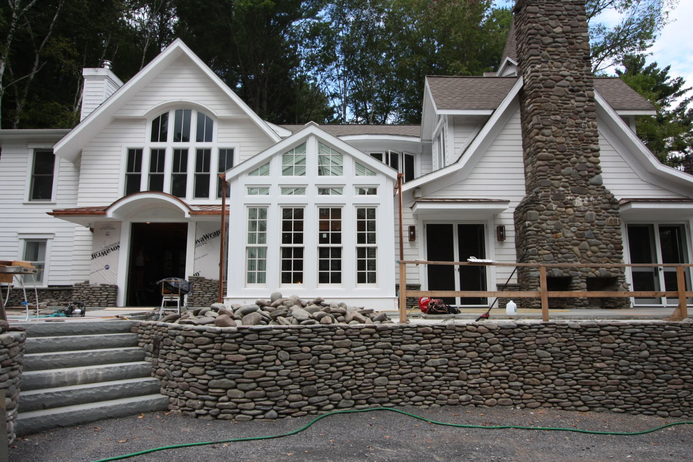
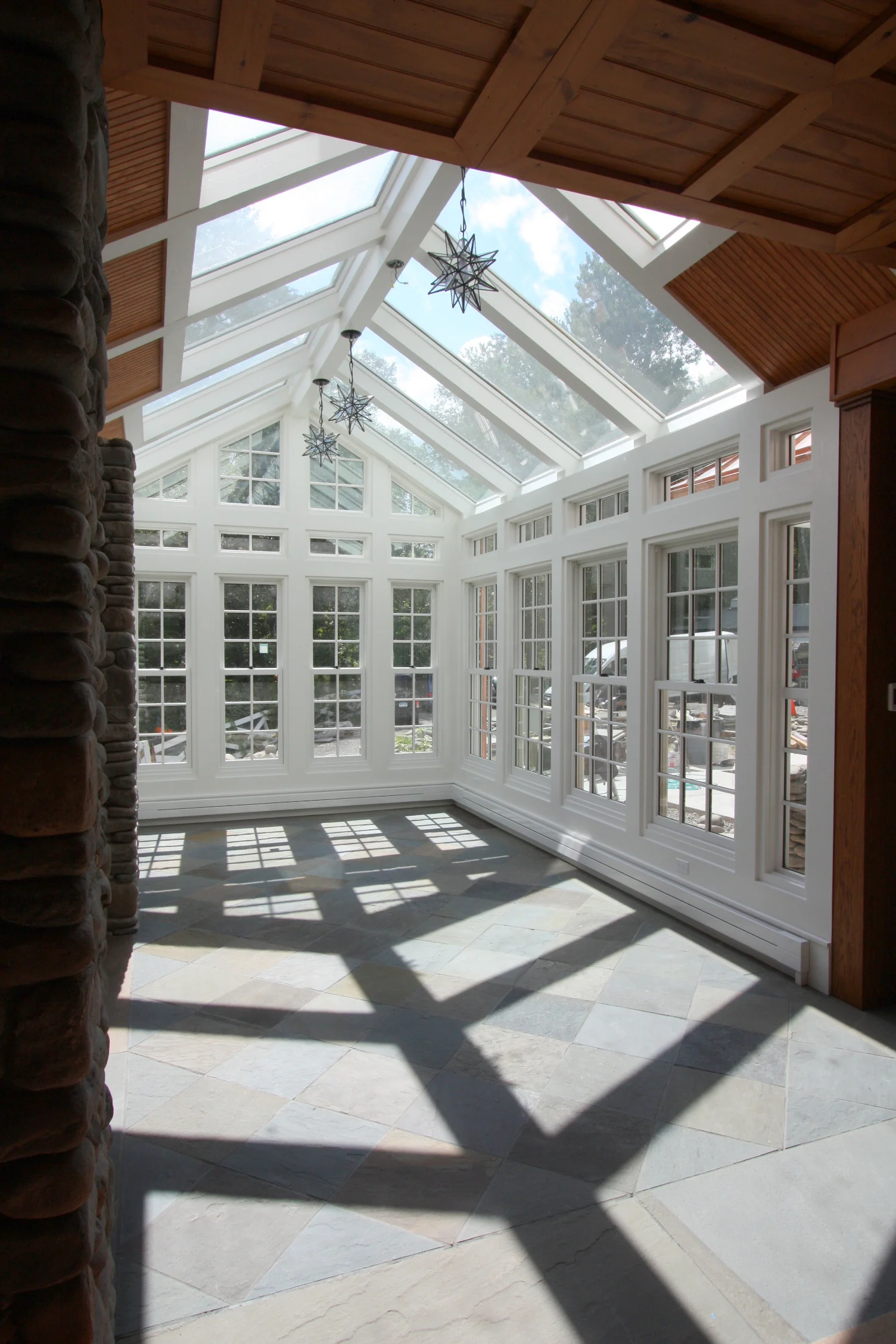
With the interior resolved, the outdoors remained inaccessible primarily because the house was raised a few feet above grade. Yet the landscape is beautiful and the idea that it couldn't be experienced was bothersome. The solution involved raising the grade along the primary facade to align with the first floor of the house so that a wheelchair could circumnavigate the new greenhouse going from inside to outside to inside, all the while enjoying the visual beauty of the rolling hills. Raising the grade eliminated the need for a ramp. At the same time, a number of drainage issues were resolved.
Raising the grade required a retaining wall. Since a wall comprised of small stones alone could not retain the land, an 8" reinforced cast-in-place structural concrete wall was poured on a new elongated concrete footing known as the heel of the cantilever-type retaining wall. Interestingly, though, at the patio, where the grade change was most severe, the patio slab that is tied to the wall, resists overturning and obviates the heel. In effect, the stone, serving no structural purpose, may be considered a decorative veneer - albeit a thick one.
The sinuous wall will be capped with a 2" bluestone coping and a cast iron rail. Since the stone wall curves, there's been some debate about fabricating it digitally, which would require the surveyor to return, or making cardboard templates on-site. Architecture is all about locating points in space.


