One of the great things about liking architecture is that it provides an entry point to anywhere you go. In the summer of 1989, having just completed my first year of architecture school, I fled to LA, slept on a friend's couch, bought a few guidebooks, worked at an architecture firm, and drove around looking at noted buildings. I learned the city. My work the following semester was much improved.
When I travel, I do a similar thing -- find a few important buildings and use them as landmarks to orient my way around the city.
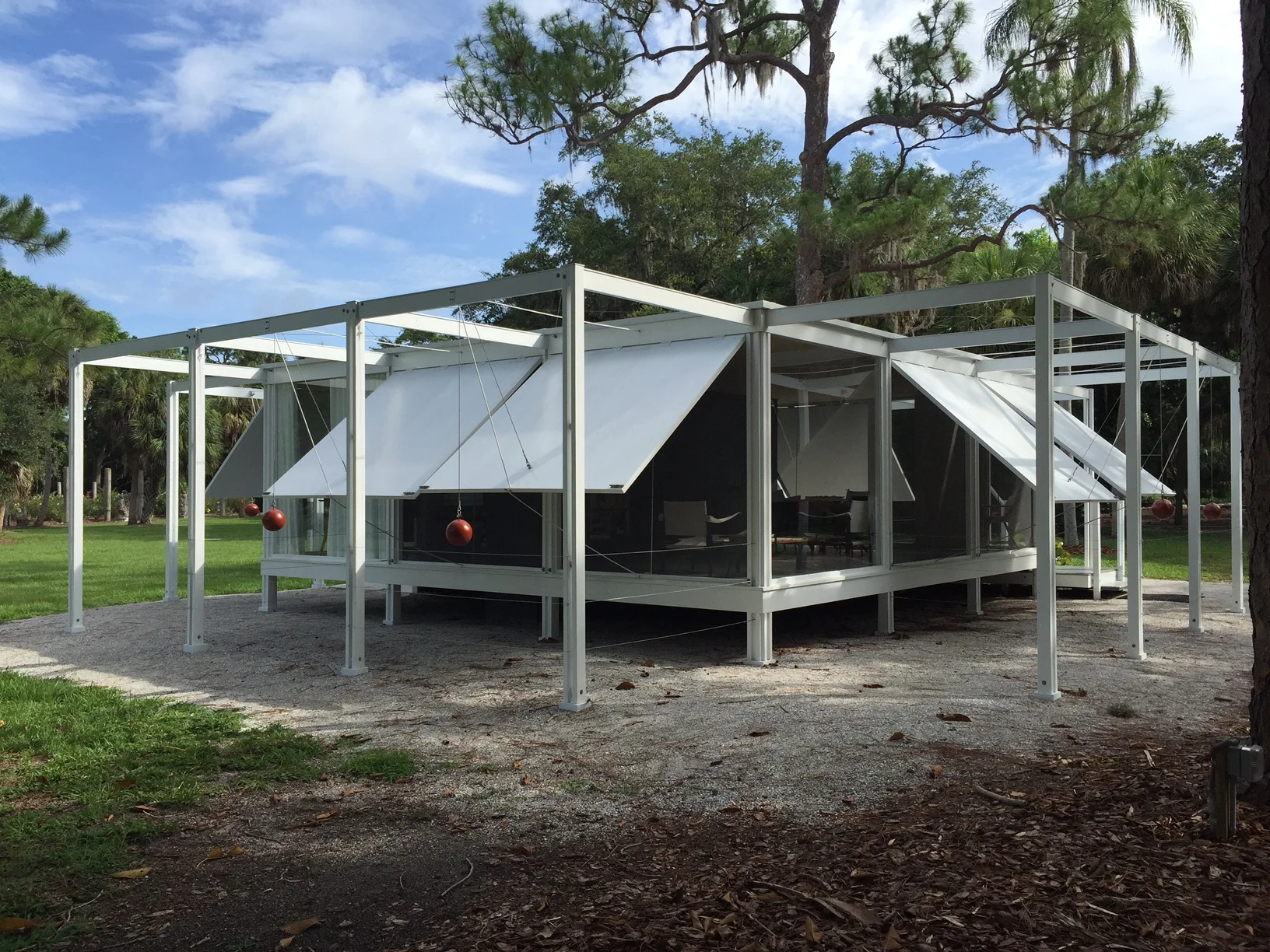
Last Thursday night I had to hurry down to Sarasota to go to a funeral. On Saturday, I got to squeeze in some time to see some buildings. I started at the Ringling Museum close to my hotel and airport. I was in a hurry, and showed up early when one could only walk the grounds but not enter the museum. I was there to see a full size replica of Paul Rudolph's 1952 Walker Guest House actually situated on Sanibel Island.
I was excited to see Paul Rudolph's Sarasota work. I went to the Yale School of Architecture and, while Paul Rudolph was the Dean there in the early 1960s, he completed Rudolph Hall, formerly and affectionately called the A&A and perhaps the most significant building in his entire oeuvre. Rudolph Hall, an icon of Brutalist architeture, is all about mass whereas the Sarasota houses from the early 1950's are light and thin.
Back to the Walker Guest House:
Re-Creation of Paul Rudolph's 1952 Walker Guest House,
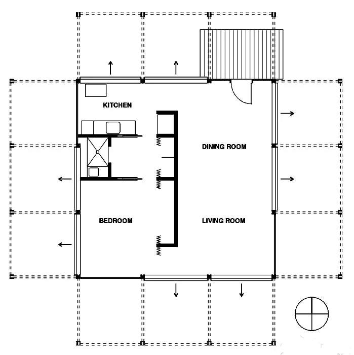
I approach the house as a pavilion in the landscape. While the house proper is a simple square in plan, its overall form, including the perimeter pergola support structure, is actually a Greek cross. It is bi-laterally symmetrical with four similar facades. I start to think of Palladio's Villa Rotunda. Is the Walker Guest House a classical building? No.
Rudolph incorporates elements of Wright, at least in plan. He violates the symmetry, puts the entry on the corner, and deploys a pinwheeling effect in positioning the window shades. And, oh those shades are interesting. They allow the building to change. They create a spatial zone around the building enclosure and the landscape, a sort of interstitial buffer between public an private space. Within the house, elements are set free from the structural grid established on the outside. Partitions are held back from the window wall, International Style.
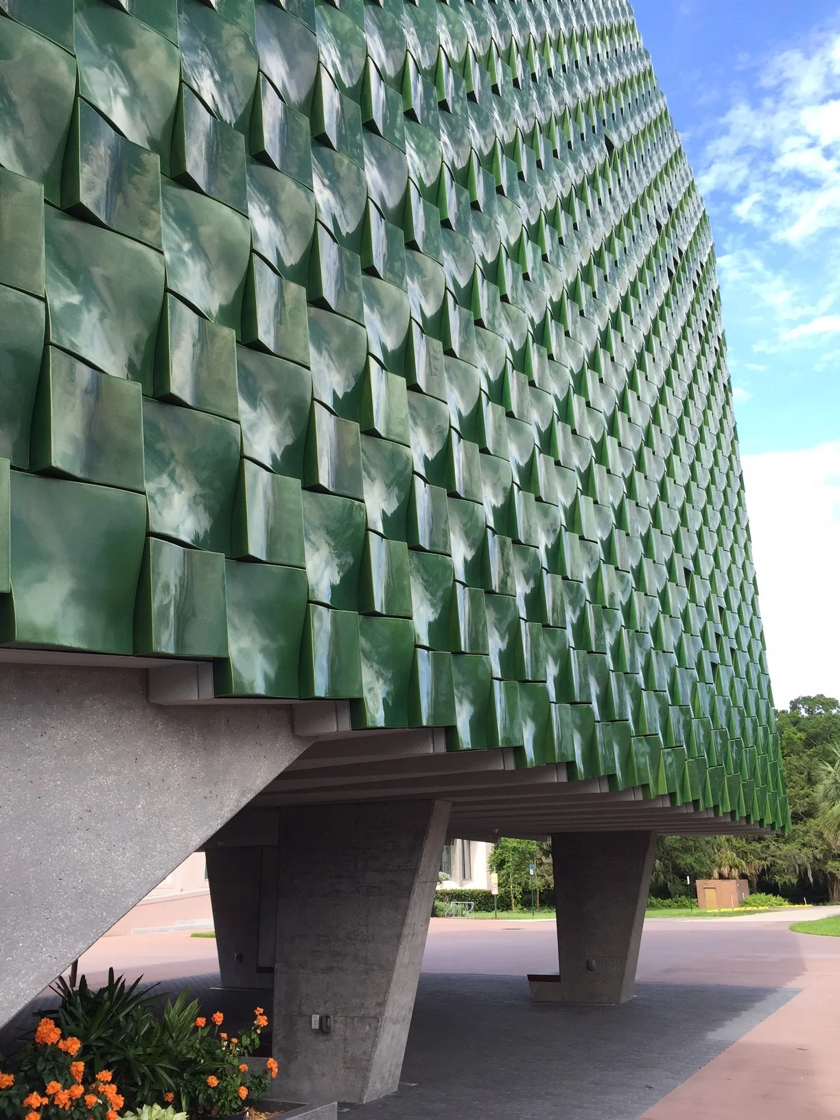
While still at the Ringling, I strolled over to the brand new addition for the Center for Asian Art by Boston architects Machado and Silvetti. Because the museum wasn't open, I couldn't get inside but from the outside, it's straight Corbu - raised on pilotis (columns) and greatly recalling LeCorbusier's Unite d'habitation in Marseilles (1952). This is a striking building with a beautifully crafted facade but, perhaps, not a great one. I have questions about the overall massing (a bulky block) and the color (a bright bottle green) having nothing to do with the existing building and incapable of foiling it effectively. I do, however, like the way Machodo Silvetti created benches at the base of the columns, recalling some of their earlier work, and the way the facade panels wrap the soffit.
I liked the Ringling Campus and hope to return sometime to fully explore it. More on Sarasota architecture to come.
.


