Last Saturday, I saw "A Japanese Constellation: Toyo Ito, SANAA, and Beyond" at the MOMA in New York. I liked the show but I'm not sure my 14 year-old did. It's a difficult show to view with images projected on rough gauze and few completed buildings. The models were better. The lack of color added to a sameness among the featured architects, but I guess that was the point of grouping them together in such a show.
I came away from the show with the following generalizations about the work:
Their beer is light, but the structure is even lighter. No one makes lighter architecture with thinner structural elements. Elegant!
Most of the projects are stand-alone buildings that are so unique they border on the solipsistic. Many of the buildings are devoid of an architectural program - they are vast open spaces - galleries, libraries, showrooms, etc. Corridors and traditional circulation have been virtually eliminated. How would this approach adapt to a programmatically complex, mixed-use building in an urban center?
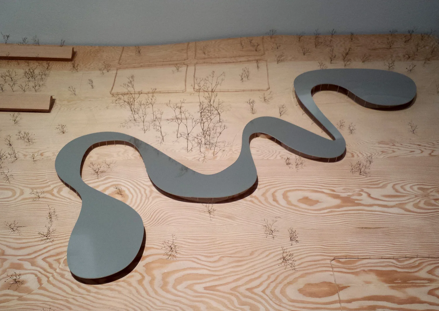
These amorphous sheds suggest continuous space in all directions, ostensibly a very 20th Century modern notion. However, this group of designers has successfully freed themselves from the constraints of Cartesian, or Miesian, architecture. Not only does this occur in plan but it occurs in section as can be seen in the way that Grace Farms follows the undulating topography.
These buildings are emphatically non-hierarchical. I kept wondering how one knows where one is in such a building. Where along a continuous spiral path do you meet a friend? What prevents one from getting lost in a forest of columns?
I remain most impressed by the elders of the group starting with patriarch, Toyo Ito. He's made so many interesting buildings but, in a way, the Sendai Mediatheque seems most pertinent to the current grouping. Next in line is SANAA. I like almost everything they've done --though I wish I could expunge the New Museum in NYC from their oeuvre or, at least from my mind.
SANAA - model of Grace Farms
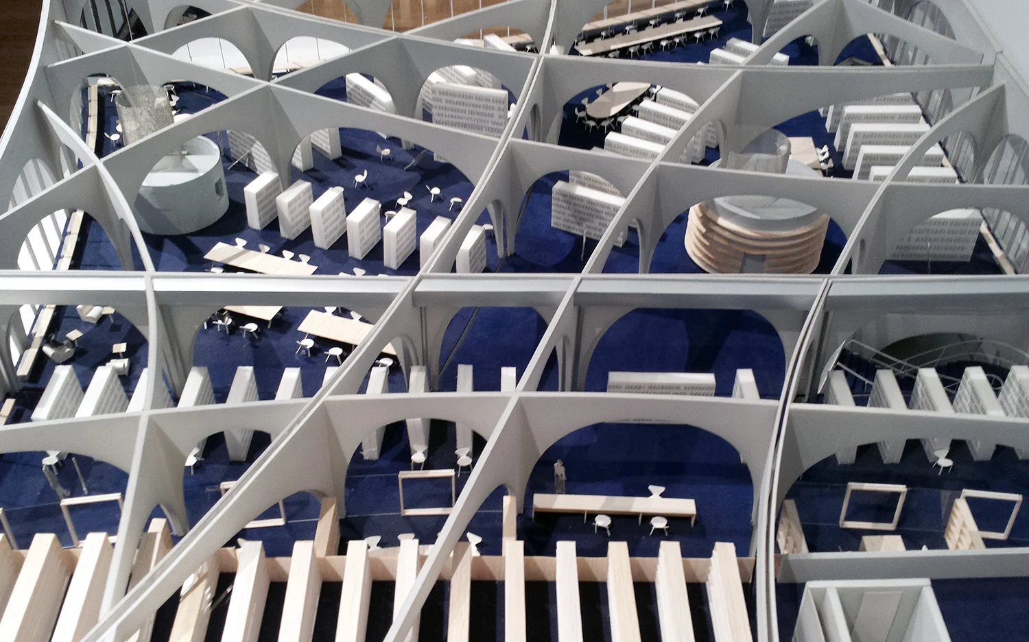
Toyo Ito - model of Tama Art University Library
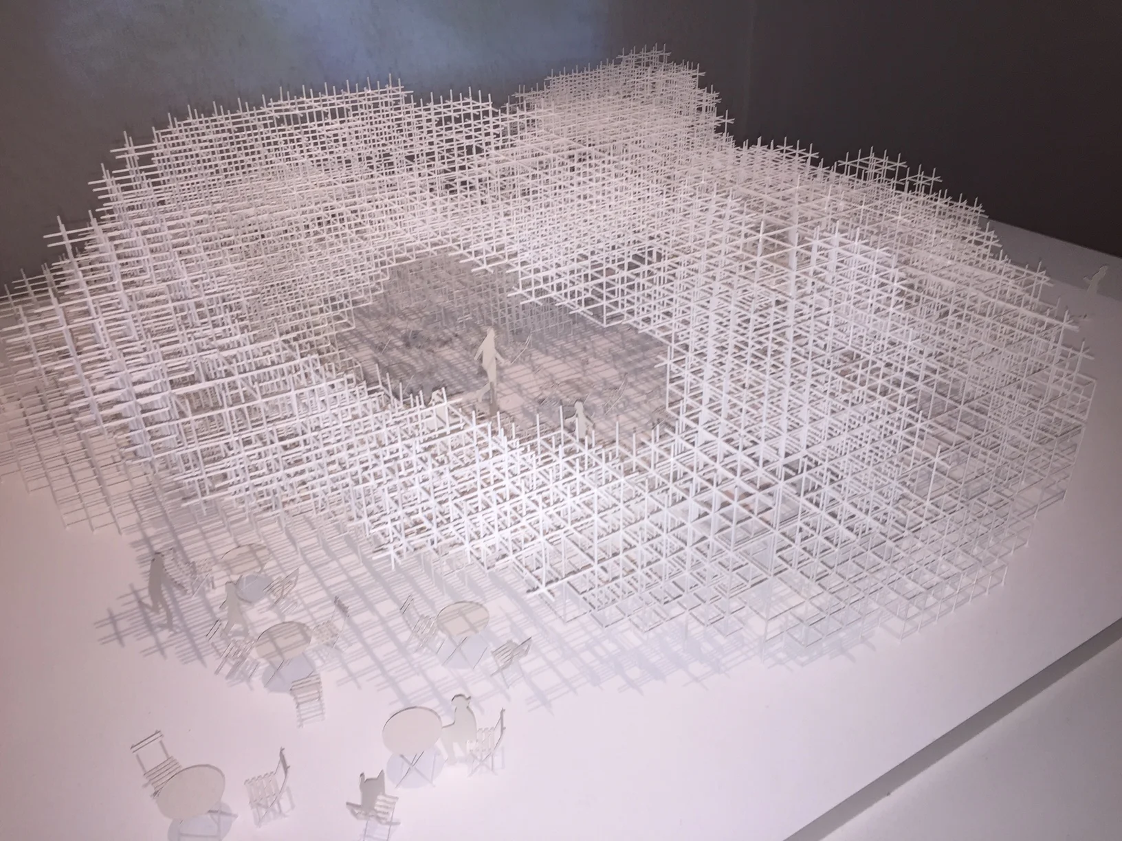
Sou Fujimoto - Model of Serpentine Pavilion


